WARM HOME
in
autumn tones
For most architects and designers, the arrangement of a small space represents the biggest challenge in terms of organizing and coordinating all the necessary functional units while completing aesthetic requirements.
However, in such projects, large constraints often by themselves condition and define certain solutions, by which the designer partially relieves responsibility “for the same. On the other hand, when there is a luxurious and flexible space where practically everything is feasible, this at first glance acts as an ideal situation for the one who arranges space. That is true, but we can only say it when it comes to talented designers.
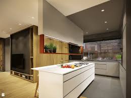
The luxurious apartment that the Polish studio PlaSterina has arranged for a young family is the perfect combination of colors and materials, applied in the modern Scandinavian style. The largest part of the apartment occupies a living zone which is by unusual elements dividd into functional subcategories – living room, dining room and kitchen.
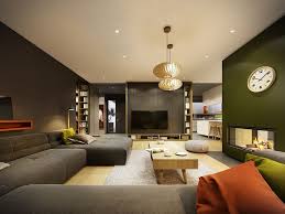
The living room is situated in the largest area, which is very well lit with wide windows. It encouraged designers to choose a darker color. Photographs testify that they did not make mistake because, despite the dark gray walls and furniture for sitting, the space doesn not look at all cramped and dark. Certainly well-designed lighting, the built-in dotted LED illumination spread over the ceiling, and two striking lusters in the central part of the room, certainly contributed to this.
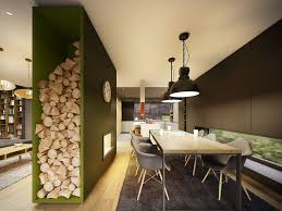
This is a thick barrier wall with a modern glazed fireplace, while on the side there is a high shelf for wood. The flames of fire and robust wood perfectly fit with olive green, which was chosen for this partition element.
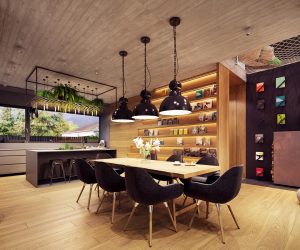
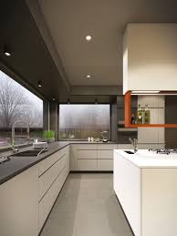
The dining room is equipped with a large table with metal legs and a robust wood panel, for which Ims chairs are upholstered with gray furniture. All this is rounded up with black metal lusters, so the whole ambience has a bit of industrial style. An unusual detail in this unit is a wide horizontal window set very low, almost at the height of the floor. The wall in which this window is located is covered with anthracite gray panels, with which the built-in kitchen elements perfectly melt. A particularly interesting detail is the vertical niche with bottle holders.

In large apartments with many rooms it is often inevitable that a large part of the area is spent on communications, that is, halls. The best thing that can be done in these situations is that the halls are practically used, as is the case in this apartment. It has two long halls, with walls being used for the installation of the elements for disposal.
In one is a library, in another closed closet with interesting details, open orange shelves in the bottom of the elements, which are used for footwear and in effective contrast with the gray front of the closet. The apartment has one bedroom, which is the the simplest room, and it is the most appropriate for its purpose. Stylish and colorful, it is completely aligned with the living zone, but the impressive colorful accents are completely omitted.
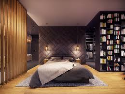
A striking detail is the wall behind the bed, whose entire surface actually imitates the bed’s head, since it is upholstered with gray furniture. This treatment of the wall surface also provided an excellent sound insulation of the bedroom. The bedroom also has a separate bathroom, which is arranged in an equally simple way – with white floor tiles and walls and furniture elements combined with black and wood.
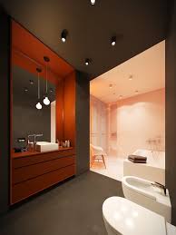
In the zone of the toilet, the black color is absolutely dominant, which is chosen for floor and wall tiles, as well as the color of the ceiling. On such base only the white sanitary elements stand out, but also an interesting piece of furniture for storing – a red cabin under the sink, placed on wide niche, framed by the same material from which it was made.
Unlike the toilet, the shower area is characterized by complete whiteness. This creates a very effective contrast, and the transition from one unit to the other is further emphasized by hidden led tape at the boundary between the black and white wall surface. Minimalist arrangement, total contrast and equal proportions of these two units at first glance create an illusion that one represents the negative of the other.


